Customer Stories: Designing for AI in Healthcare
We revolutionized the user experience and interface of Evidium, a cutting-edge app driven by artificial intelligence and a knowledge graph, specifically designed to assist physicians in accurately diagnosing patients.
User Feedback
"Felt like I was seeing the future of medicine."
"Easy to use and adapt to..."
"Made me feel like I had more knowledge at my disposal."
Background
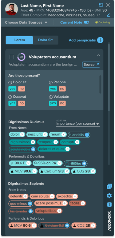
Evidium is a pioneer in the development of cutting-edge artificial intelligence (AI) technologies that are rooted in evidence-based medicine (EBM). Their innovative platform empowers healthcare professionals by providing real-time insights and invaluable suggestions for informed decision-making at the point-of-care. By leveraging data from clinical charts, live patient conversations, domain ontologies, and test results, their product delivers contextually relevant recommendations that enhance the quality of care..png "Medical Diagnostic App Design System (1)")
We improved trust, reduced clicks, and made over 80 user experience recommendations for an app powered by AI and a knowledge graph that helps doctors diagnose patients.
How We Helped
To create an experience physicians could trust, Evidium enlisted the expertise of Predictive UX to design and evaluate the user experience and information system design.
Our comprehensive approach involved delving into the specific needs of physicians in diverse clinical settings through extensive user research. We then crafted innovative and visually impactful data visualizations for the Evidium application.
To ensure the highest level of usability, we conducted multiple rounds of rigorous usability tests with physicians, evaluating their mental workload using the NASA-TLX and measuring usability on the System Usability Scale. These invaluable insights informed our design iterations, resulting in an exceptional user experience.
What We Did
We collaborated closely with Evidium to explore user feedback, reduce mental workload, and develop the perceived ease of use, satisfaction, and learnability of their application.
To arrive at our findings, Predictive UX conducted rigorous testing on a prototype we designed across 4 studies encompassing 30+ Tasks with 8 participants. Our work included designing the studies, facilitating each session, conducting SUS and NASA-TLX assessments, analyzing findings, making design recommendations, and working with the client to iteratively update and re-test designs.
Delivery Time
There were two phases to our initial work totaling 8-weeks. During this time we focused our activities on User Research, User Testing, UX Design and UI Design. We concluded with a final report on our findings and recommendations.
Our Approach
First, we set the baseline usability score of the existing app before making any design updates. We used the NASA-TLX and System Usability Scale (SUS) to collect quantitative findings for a benchmark as a way to measure the effectiveness of design updates across three additional usability studies. We delivered over 80 prioritized design recommendations, 65 of which we were able to incorporate back into the Figma prototype and re-test for acceptance. In parallel, we worked on a design system to simplify dev consumption and future designs.
Outcomes
The outcome of our efforts included changes to the UI layout, information hierarchy, user flow, color scheme, and label placement resulting in moving the original experience from Medium to Low cognitive strain on the NASA-TLX and from a marginal score of 65 to an acceptable score of 80 on the System Usability Scale.

Results
Predictive UX validated the application for product-market fit and through our testing and iterative design updates; we:
- Improved the System Usability and NASA-TLX scores
- Increased user trust
- Reduced time to information
- Improved clarity
- Improved chances of adoption
- Improved accessibility
- Reduced clicks and scrolling
One of the most interesting findings came out of a "blue sky" activity where we imagined designing this application as if we had never seen the client's version of the UI. This produced a dark mode version of the application, which improved accessibility and received unanimous praise as the favorite color scheme for users, our client, and the Predictive UX team.
Changing the UI design from light mode to dark mode greatly increased contrast between this application and underlying application that this new app would "sit" on top of in the UI.
FINAL DESIGN CONCEPT